
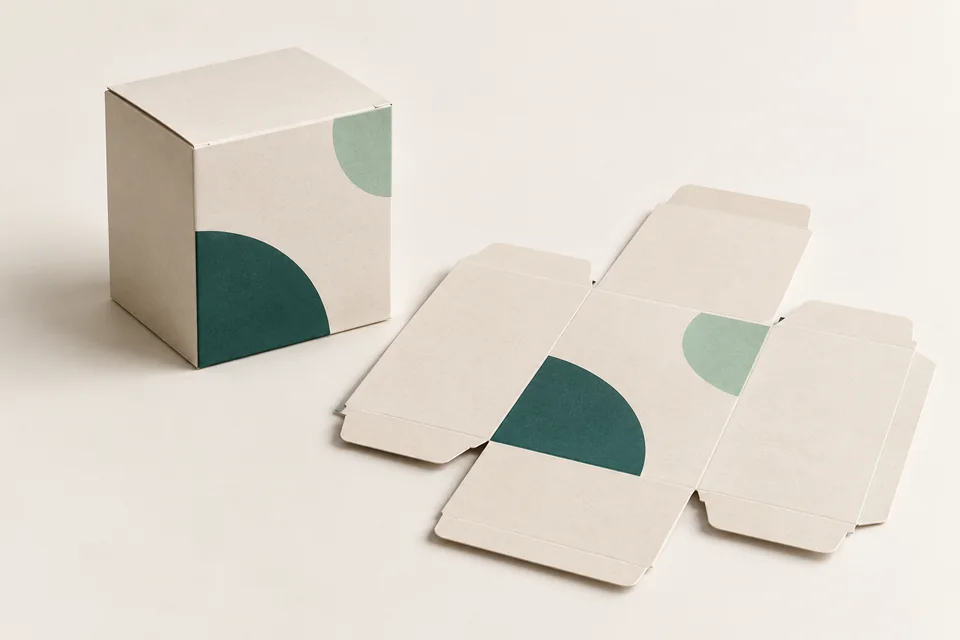
Packaging needs to help buyers recognize the product and find necessary information. If every line of text stands out equally, readers can easily miss the content. Reading order should be determined before adding images and effects.
Distribution of content on each side of the packaging
The main side is usually for the brand and product name; Other sides may contain instructions or parameters. Product owners need to confirm the list of required information by industry and market before designing.
Divide read priority
| Level | Task example |
|---|---|
| Quick recognition | Brand and product line |
| Choose the right one | Specification, version or main features |
| Use correctly | Instructions and related information |
Separate groups of information by spacing, font size, and contrast. There is no need to fill every empty area. With a kraft or dark colored background, test the text on real paper to see if it's clear enough.
Browse text at print size
Print to the correct scale and build into a box. Ask someone who hasn't been involved in the design to find names, specifications, or instructions. Check that the text near the fold, cut edge and glued area is not hidden or difficult to read.
A small box does not necessarily contain the entire brand story on the front. Can lead to information page for long content, but must still keep mandatory content on the packaging.
Browse content before processing effects
Browse names, Vietnamese accents, units, product codes and link addresses before making effects. With multiple versions, use one content category so you don't miss recurring errors.
Is there a common font size for every box?
The appropriate font size depends on the font, contrast, surface and market requirements. Judge on the final sample instead of applying one size to every box.
Send SquareBag the confirmed content and the template to review the layout together before pre-production.
Explore Design and publishing or Exchange specifications with SquareBag.
See Packaging Design group